Minnesota Prairie Roots

Writing and photography by Audrey Kletscher Helbling

Sample billboards along Interstate 90 in Wisconsin February 19, 2020

Filed under: Uncategorized — Audrey Kletscher Helbling @ 5:00 AM
Tags: , , , , , , , ,

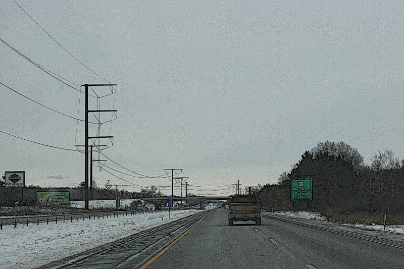
Drive Interstate 90 between La Crosse and Madison, Wisconsin, and you’ll see lots of billboards around the larger cities and in the area by the Dells. Edited Minnesota Prairie Roots photo.


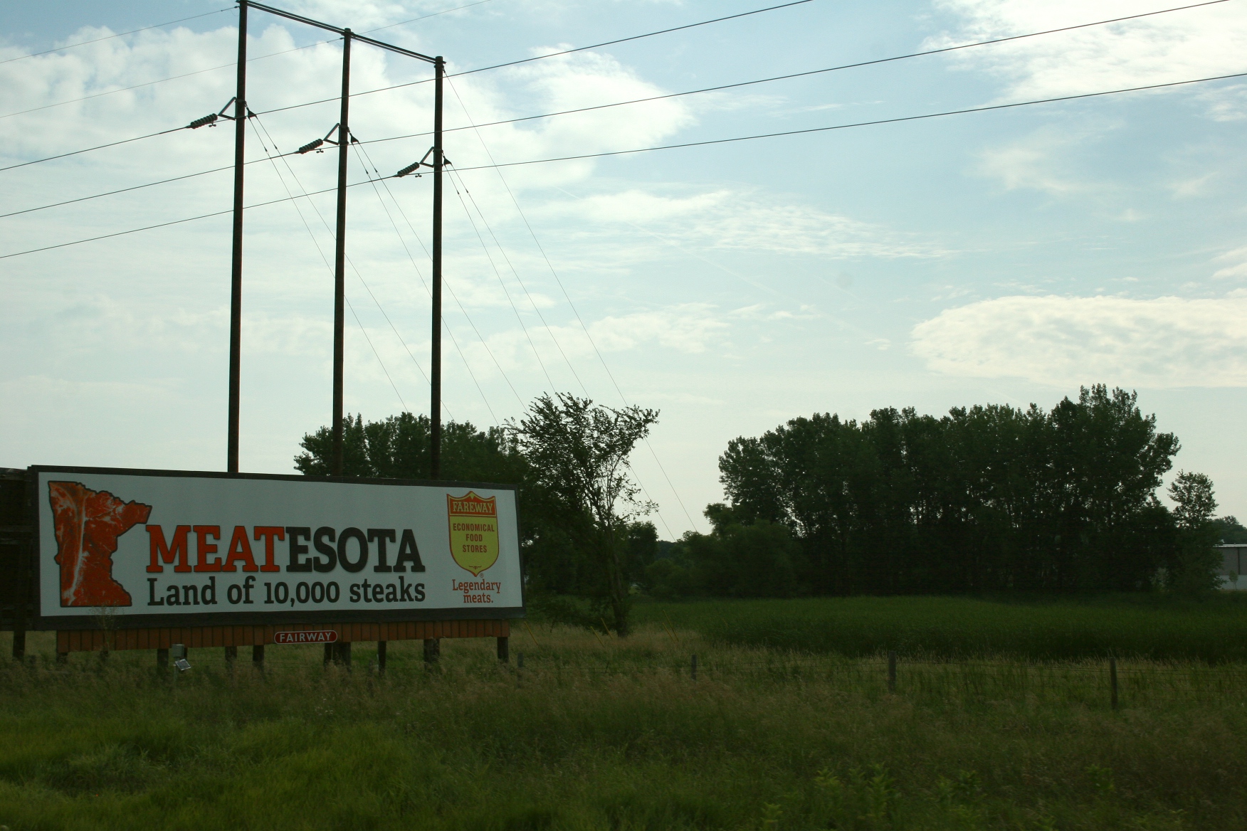
BILLBOARDS CAN CLUTTER the landscape. Too many words. Too many materialistic messages. Too much visual imprint when I’d rather see the natural surroundings.


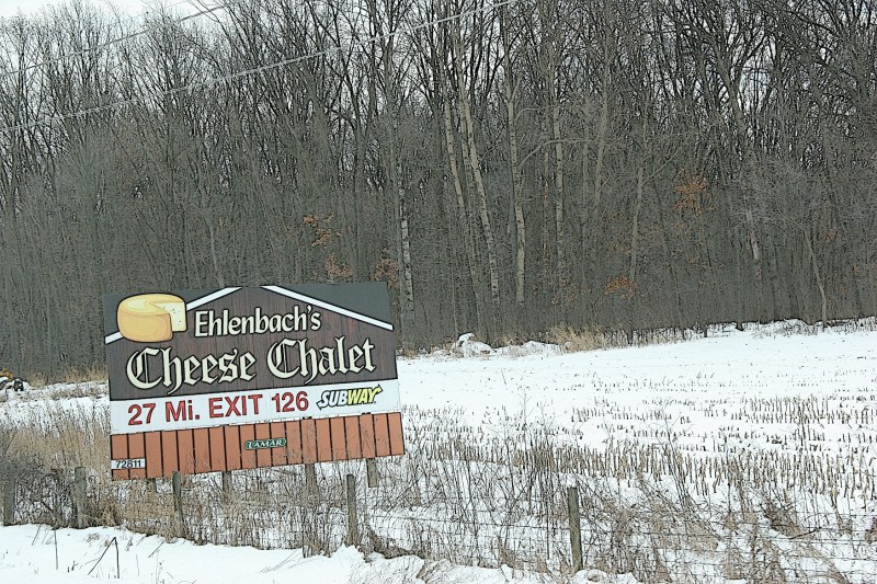
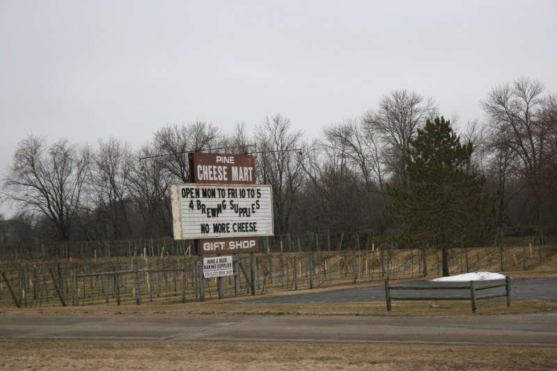
As you would expect in Wisconsin, there are lots of signs for cheese places along I-90. Edited photo by Minnesota Prairie Roots.


But I understand the value of signs, large or small, in drawing people into businesses, to destinations, to detour off the interstate. That said, I noticed a lot of vacant billboard real estate while traveling Interstate 90 from La Crosse to Madison, Wisconsin, this past weekend. I can only speculate that in a tech driven world, this form of marketing to the masses is declining.


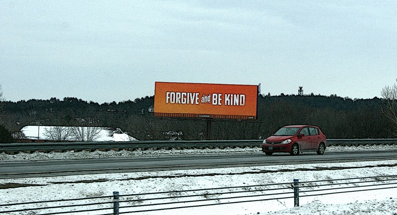
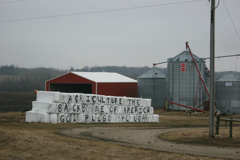
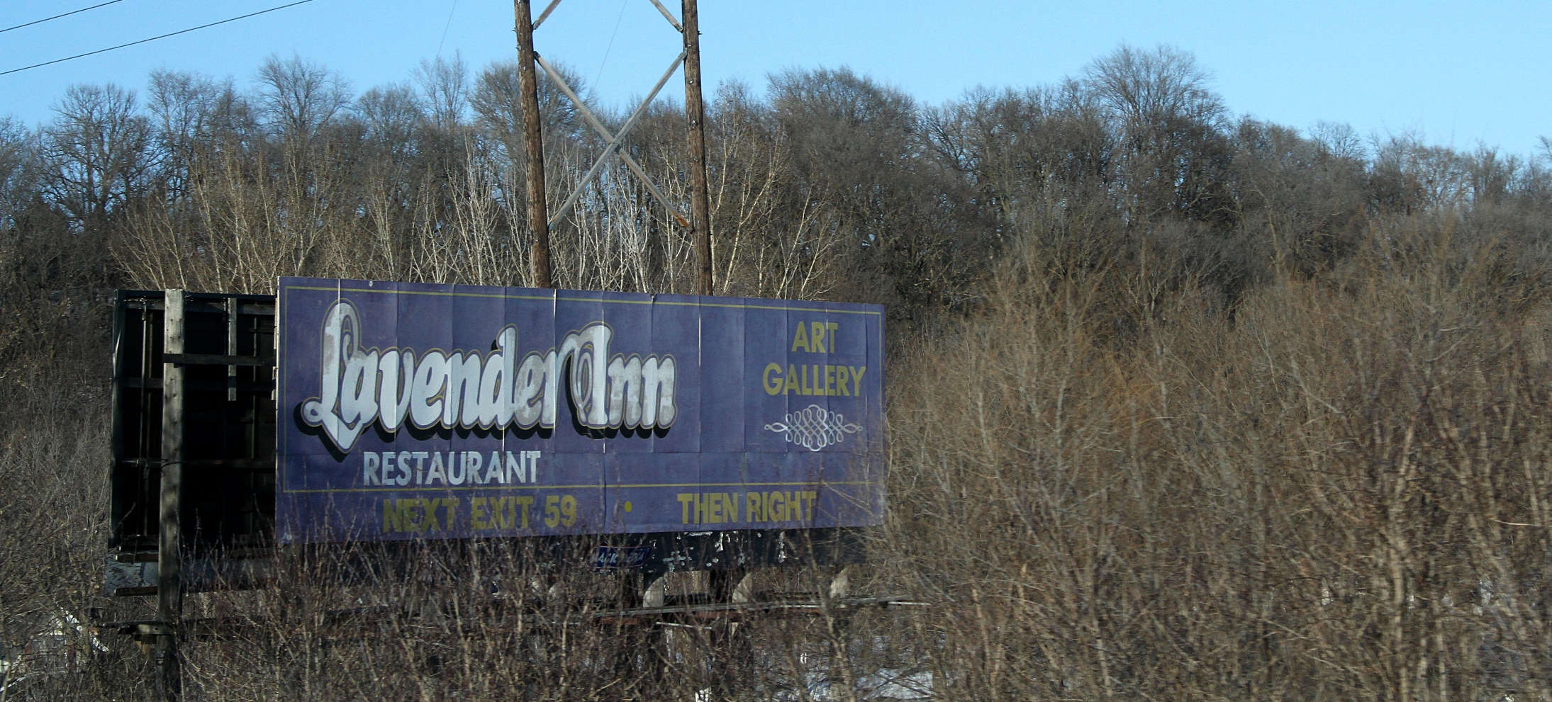
Edited photo by Minnesota Prairie Roots. Anyone know the story behind this billboard?


Still, I pay attention to roadside signage and noticed a billboard with a simple and profound message: FORGIVE and BE KIND. I photographed the sign within 10 minutes of Exit 69, the road to Mauston and Oxford. A LAMAR Advertising credit runs along the bottom.

FORGIVE and BE KIND. The words are simple enough. But forgiveness and the added directive to “be kind” can prove a struggle when the pain and hurt run deep. Yet, both can be achieved. It takes work. Time. Healing.


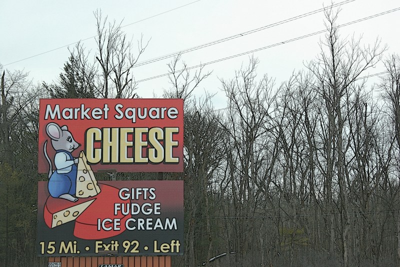
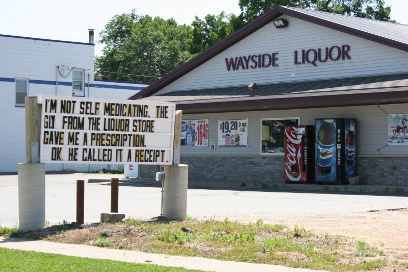
Another cheese sign along I-90 in south central Wisconsin. Edited photo by Minnesota Prairie Roots.


I’d like to hear your thoughts on the FORGIVE and BE KIND billboard and/or on billboards in general.

© Copyright 2020 Audrey Kletscher Helbling


Along Highway 52: About that popcorn & cheese June 5, 2017

SIGNAGE INTERESTS ME. For many reasons. The graphics. The message. The marketing influence. The persuasive power.

Occasionally signage can confuse or present an unclear message.

Let’s consider three signs along U.S. Highway 52, a high traffic four-lane that I sometimes travel between Cannon Falls and Rochester. On my most recent trek along this roadway, I photographed two signs by Pine Island.


The first grabbed my visual attention because of the oversized popcorn kernels scattered on the ground below a popcorn billboard and the single word, Newt’s. What is this sign advertising? A popcorn place? Not quite. Newt’s does have, according to online reviews, some of the tastiest popcorn around. But Newt’s is a beer and burger place that also serves popcorn.

Digging deeper into the popcorn pile, I read on Newt’s Facebook page that the business pops an average of 20,000 pounds (or 10 tons) of popcorn kernels in a year at its north, south and downtown Rochester locations. Now that’s a lot of popcorn. I wonder how much beer is served.


The second sign I photographed promotes a cheese mart. But if you look closely, you will see that the Pine Cheese Mart no longer sells cheese. That’s right. Tacked onto the bottom of the sign is the notation that you can purchase beer and wine making supplies at Von Klopp Brew Shop, once also a marketer of cheese.

When the northbound highway access to the cheese mart was closed, the business took such a hit that it stopped selling cheese and closed its restaurant and gift shop, according to the business website. I wonder how many travelers catch the cheese mart part of this sign and miss the details.


The last “sign” I photographed is farther north on 52 and visible from the southbound lane. There’s nothing fancy about this handcrafted message. It’s simple and to the point. The landowner appreciates farmers and loves his country. Perfect.

© Copyright 2017 Audrey Kletscher Helbling

NOTE: I photographed these signs several months ago. They may or may not still be in place.


My current favorite national marketing campaign December 29, 2016

Filed under: Uncategorized — Audrey Kletscher Helbling @ 5:00 AM
Tags: , , , , , , , , , , ,

mandarins-ad-campaign-billboard-67


SEVERAL WEEKS AGO a billboard along Interstate 94 in Rogers popped out at me. Not like a jack-in-the-box or a creepy clown. But visually.

The simplicity of the graphic design and the short, powerful message of “Good choice, kid.” made this advertisement noticeable among all the roadside clutter.

This Wonderful halos billboard is part of a $30 million ad campaign focusing on kids who choose mandarins over something less desirable. So I learned while googling the slogan. To totally understand this, you have to view the television spots that are part of this campaign. Kids star in videos with storylines that present a temptation—like sleeping over in a creepy doll-filled mansion or running away to join the circus—and the obvious better choice of a mandarin.

The ads are quirky, funny and, yes, most assuredly memorable. To the creative forces behind the Wonderful Halos newest marketing endeavor, well done.

TELL ME: What ad campaigns, past or present, do you consider especially well done and memorable? Why?

© Copyright 2016 Audrey Kletscher Helbling


About that McDonald’s muskie billboard… September 16, 2016

Filed under: Uncategorized — Audrey Kletscher Helbling @ 5:00 AM
Tags: , , , , , , ,

McDonald's muskie billboard in Minnesota


WHEN I SPOTTED this billboard about six weeks ago in the north metro, I wondered about the muskie part of the message. I still do. Other than catching muskie in the summer and preferring a smoothie in the heat of summer, I don’t see much connection between the two in this McDonald’s ad.

I wondered if I was missing something. So I googled the topic to find a column by Pioneer Press Outdoors Editor Dave Orrick titled “Some people really do hate muskies. There, I said it.” He then laid out the polarizing story of muskie stocking in some Minnesota lakes. It should be noted that his opinion piece is not tied to the McDonald’s ad. It just happened to rank third in my Google search.

After reading Orrick’s column, I offer two suggestions to McDonald’s: Don’t erect an identical billboard in Cass or Crow Wing counties. Or choose a different, less controversial, fish.

© Copyright 2016 Audrey Kletscher Helbling


The connection between a pony, Preparation H & a liquor store June 22, 2016

Filed under: Uncategorized — Audrey Kletscher Helbling @ 5:00 AM
Tags: , , , , , , ,

I’M NO MARKETING EXPERT. But I did take advertising and public relations classes in college, a requirement of my Mass Communications degree. Yet, degree and media experience aside, I rely primarily on my initial emotional reaction to rate the success or failure of media campaigns.

I find myself most drawn to advertising messages that tug at my heartstrings or offer a bit of unexpected humor. Flashiness and celebrity endorsements don’t impress me. Simplistic and relatable do. Punch out a strong message, boom, and you’ve got me. Word choice matters, as do music and setting in TV commercials and radio spots.

I photographed these little ponies at Sibley Park in Mankato.

I photographed these miniature horses at Sibley Farm in Sibley Park, Mankato, Minnesota.

My husband will tell you I seldom pay attention to television commercials. For good reason. Most aren’t worth my time. But he’ll also tell you there are exceptions. When the Amazon Prime ad featuring a sweet little pony airs, I crank up the volume like I’m listening to a favorite rock band. I love everything about that commercial from the music to the horses to the pure cuteness factor. I am obsessed to the point of wanting to purchase a little pony for my granddaughter. Isabelle is only 11 weeks old. I’m not serious, of course. But if I lived in the country…

From ponies to Preparation H, a new hemorrhoid treatment commercial filmed in the small southern Minnesota community of Kiester also rates as a current favorite. I applaud the marketing genius who connected kiester to Kiester and came up with this humorous, thinking outside the box ad.

Small towns can be a hotbed for unique advertising. For example, I spotted this sign outside Wayside Liquor in Montgomery (Minnesota, not Alabama) on Sunday:


Wayside Liquor sign in Montgomery, 14


A quick Google search indicates Wayside Liquor staff didn’t create this message. But they clearly knew the humorous words would grab the attention of motorists traveling along busy Minnesota State Highway 13. The sign works in directing attention toward the liquor store. Boom.

How about you? Do you have a favorite TV commercial, radio spot, print ad, sign, billboard? What makes it a winner?

© Copyright 2016 Audrey Kletscher Helbling


Bibby Bobbie Bibster bumper sticker February 25, 2016


Turbo Tim's Anything Automotive bumper sticker


EVERY BUMPER STICKER writes a story.

So what’s the story with the bumper sticker on the right, spotted while waiting at a stoplight in Burnsville a year ago?

The grammar police in me wanted to correct this sentence: My car sucks my Mechanic is on speed dial!” to “My car sucks. My mechanic is on speed dial.”

But, hey, it’s just a bumper sticker, I considered, and opted to focus on the message. The humor clearly works.

As much as words draw my attention, the cat graphics prompted me to learn more about Turbo Tim’s Anything Automotive. What’s a cat got to do with an auto shop in Northeast Minneapolis?

A lot apparently. A black cat, Bibby Bobbie Bibster, according to Turbo’s website, has been a certified Shop Kitty since 2011 and has worked the waiting room for the past three-plus years loving up customers.

That explains the black cat.

There’s one more thing. Slap a Turbo bumper sticker on your vehicle and you’ll get 10 percent off your bill up to $50 for the life of the car.

Based on reviews, Turbo Tim’s seems a customer-friendly place with folks using words like “trustworthy, honest, reasonably priced” and more to describe their experiences.

I can’t personally vouch for the service, but have no reason to doubt the testimonials.

As for the marketing, I peg it as creative and memorable.

HAVE YOU NOTICED any especially creative bumper stickers?

© Copyright 2015 Audrey Kletscher Helbling


Feeling blue about the iconic Sugardale barn along Interstate 35 July 14, 2015

The front section of the barn was being painted as we drove along Interstate 35 Monday morning.

The front section of the barn was being painted as we drove along Interstate 35 Monday morning. In the center section, you can see a faint oval shape wherein Sugardale was painted.

“THEY’RE PAINTING THE BARN BLUE!” I gasped as I swung my camera lens toward the front passenger side window. So surprised was I by the in-process flashy hue application to the Sugardale barn along Interstate 35 north of the Northfield exit that I could barely compose a photo.

You can see how the barn looked before it was painted blue.

On the left side of the barn, you can see the as yet unpainted section. The barn needed paint. But blue?

“It’s NAPA blue,” I hissed to my driver husband, who works as an automotive machinist at the NAPA store in Northfield. He knows how much I dislike the shade of blue that represents this automotive business.

I continued to rant. “Why would anyone paint a barn blue? And they’re covering up that sugar sign.”

All of this I spewed as I shot several quick frames while our car traveled at 70 mph along the interstate.

How the barn looked when I photographed it in February.

How the barn looked when I photographed it in February. (This was before I had a telephoto lens.) Click on the image to enlarge.

I don’t understand why blue, rather than red, was selected for this landmark barn. Before the blue, you could see the fading advertisement for Ohio-based Sugardale Foods, “a leading provider of quality meats and premium foods.” The lettering has been there for years and has made this barn iconic to I-35 travelers in southern Minnesota.

Now the Sugardale sign has been obliterated by that, that, blue. Why?

In February 2011, I published a winter image of the barn. That fall, reader Sara G. commented on the post:

This is my grandparents’ barn. Grandpa, a retired NW Orient pilot, purchased the land in about 65, moved out there in about 74. The barn is post and beam and was built by a guy who would walk around the land and point to trees to chop down for the various posts and beams. Most still have remnants of bark on them. It is an amazing structure. We played in there every chance we got as kids.

Sadly, it will most likely hit the market in the next few years. I cannot imagine driving down 35w and having someone else live there. Or Christmas anywhere else for that matter. Thanks for the pics. You need to go back and shoot it now before the corn comes down while the color is so strong.

I expect Sara’s grandparents no longer own this property. I understand that the current owner can choose any color he/she wishes for the barn. But a vivid blue? And why destroy the memorable Sugardale signage? I feel just plain blue about this piece of rural barn history vanishing under a coat of blue paint.

#

UPDATE 1:30 PM: Bob Collins, who pens an online column, NewsCut, at Minnesota Public Radio, followed up on my post after a reader (Faith, Farming & Cowboy Boots) tipped me off that the blue barn might be a project of the Midwestern restaurant chain, Culver’s. Bob contacted Culvers and learned that the I-35 Sugardale barn is, indeed, part of the company’s campaign to thank farmers and financially assist young people going into agriculture. You can read Bob’s post at this link:  http://blogs.mprnews.org/newscut/2015/07/a-barn-turns-blue/

Also, be sure to scroll through the comments section on my post to read an explanation from Paul Pitas, Director of Public Relations and Communications for Culver’s.

#
© Copyright 2015 Audrey Kletscher Helbling


That Lavender Inn billboard needs to go March 9, 2015

AWHILE AGO, A READER tipped me off to an outdated billboard along Interstate 35 bypassing Faribault.

Finally, on purpose, I traveled that stretch of interstate specifically to see this billboard off the northbound lanes:

Not the best photo, but snapped at interstate speed passing by.

Not the best photo, but snapped at interstate speed passing by.

Now imagine you’re a traveler. You’re hungry. You see the sign for the Lavender Inn Restaurant. And bonus, there’s an art gallery. So you take Exit 59.

But then you can’t find the darned place. You see a bank and a liquor store, restaurants, hotels and other businesses in the area, even a housing development. But the Lavender Inn? Nope. Not even along Lavender Drive.

By this time you are frustrated, not to mention hungry and disappointed. You had your heart set on dining at the Lavender and perusing art.

I wonder how many times this scenario has happened. The Lavender Inn has been closed for a long time, although I can’t find the precise date of closure.

But in January 2003, long-time sole owners Gaylen and Bebe Jensen, who opened the eatery first as a drive-in in June 1960, sold the property to investors. Eventually, the restaurant, which was, indeed, painted a distinct lavender hue, was torn down, replaced by business and housing developments.

Why, then, does the billboard remain posted along Interstate 35? Its presence misleads travelers.

For those of us who remember the Lavender, though, the sign jars memories of Faribault’s finest dining establishment. I ate here perhaps less than a dozen times in a restaurant that evolved into a supper club. Remember supper clubs? Folks drove from all over to dine here on Saturday evenings and on Sundays after church.

The Lavender had its regulars, including Rotarians who met here monthly. For My husband and me, this marked a place to celebrate on the rarest of special occasions given the cost of a meal in this fancy setting.

I remember the gallery rich in gilded frames and fine art and big game trophy animals from Gaylen Jensen’s African safari hunts. It all seemed rather foreign to me. And perhaps therein was part of the appeal, along with cloth napkins.

In the digital archives of Northfield’s Carleton College I found a KYMN radio jingle for the Lavender Inn, advertised as “a portrait in fine dining…an original in dining.” It’s worth a listen (click here).

Perhaps the Lavender Inn roadside ad ought to be archived somewhere as an important part of Faribault’s restaurant history. And then replace the sign with an attention-grabbing billboard welcoming visitors to Faribault’s historic downtown.

© Copyright 2015 Audrey Kletscher Helbling


Meatesota, Minnesota, whatever August 28, 2014

Filed under: Uncategorized — Audrey Kletscher Helbling @ 6:00 AM
Tags: , , , , , , , , , ,

THE BILLBOARD MESSAGE plays on Minnesota’s tag, “Land of 10,000 lakes.”

Fareway Foods billboard

But it doesn’t work for me, this Fareway Foods sign along Interstate 35 just north of Faribault promoting the grocer’s meat department with “Meatesota, Land of 10,000 steaks.”

I don’t get it. What 10,000 steaks?

The thing is, I really do like Fareway’s meat, although I have yet to try a steak. I am not a big steak eater. But I certainly savor Iowa chops.

If this is the Iowa based company’s effort to cozy up to native Minnesotans like me with a spin on our state’s thousands of lakes theme, then this fails in my marketing book.

But I suppose in theirs it succeeded. After all, I noticed the billboard and now I’m writing about it.

© Copyright 2014 Audrey Kletscher Helbling


What will you take in trade? June 13, 2014

Filed under: Uncategorized — Audrey Kletscher Helbling @ 6:00 AM
Tags: , , , , , ,

OCCASIONALLY SOMETHING in an ad catches my eye and amuses me.

kkkklll

Read the ad directly under the 135 Garage Sales banner.

Take the Estate Sale on Sixth Avenue Southwest in Faribault.

Now let’s say I want to buy a John Deere collectible for my husband or perhaps that mink coat.

How am I supposed to pay for my purchases?

No checks, cash or credit cards are accepted.

So that leaves, uh, what? Bartering?